Visual art form
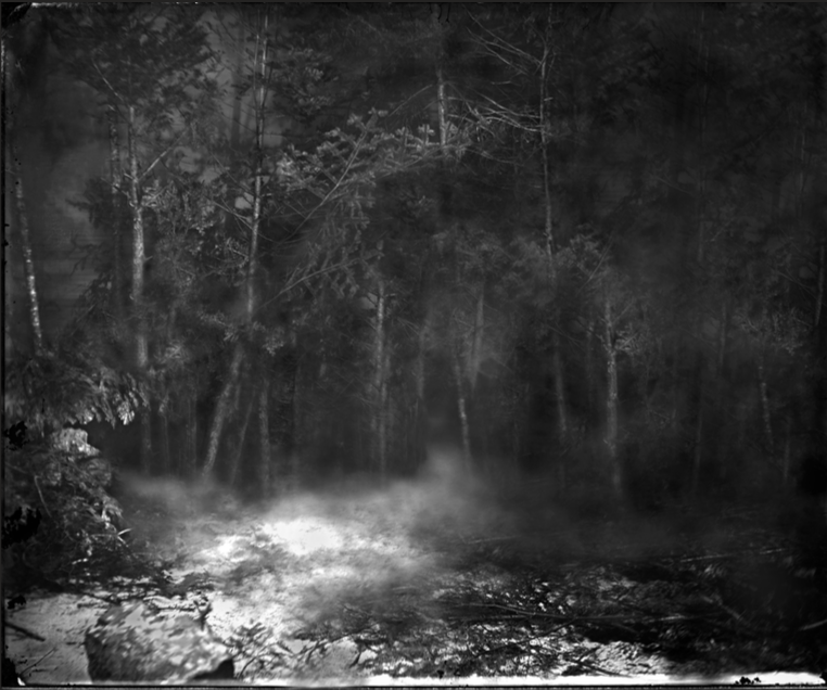
The first chapter of "Darkness" by Yedda Morrison was one that confused me greatly. At first I did not notice that the second image featured at the beginning of the book was simply an edited version of the first image. While the hunters in the wood, as well as the lack thereof, was interesting, I was more interested in the presentation of the images relative to the formatting of the book. Perhaps I was misled by the title "Darkness" – I spent several minutes staring at the black pages in between the two images and pondering their significance. Then, when I got to the actual text portion of the chapter, I was once again confused by the concept of darkness. I wasn't entirely sure what Morrison meant by a "biocentric reading of Joseph Conrad's Heart of Darkness," but I assume it has something to do with the contrast between the motifs of light and dark, as the words left untouched on the pages have light and dark associations/connotations. Before noticing this, however, I was more confused as to the use of Wite-Out all over the pages; the "Darkness" title led me to conclude the other words should be blacked out with ink, thus making the pages darker in a literal sense. Upon reading Morrison's own description, I was introduced to the other aspects of the work that I had previously overlooked, such as the disappearance of the hunters in the second image and the connections between the words on the pages of the first chapter. Thus it appears that by focusing on the lack of darkness in the chapter, I actually kept my mind in the dark – I had to actually read Morrison's explanation of her thought process to be enlightened.
.jk.10.16.
